 Block Switch Stage
This control element selects between several steps, for instance the step of a ventilation or the operating mode of a device. The tile shows the current step, a tap opens the list of all steps.
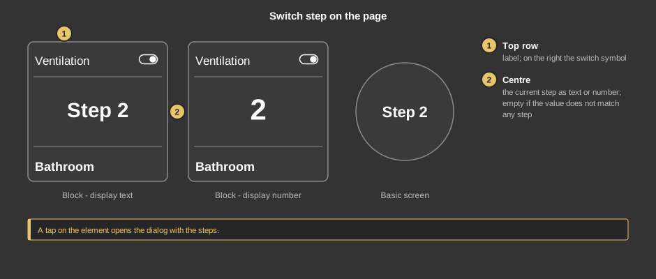
A tap on the element opens the dialog – on the tile as well as on the circle (basic screen).
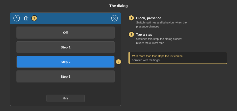
Exit closes the dialog without switching anything.
Behind the clock are switching times that switch a step at a certain time. Everything else about them is described under Presence.
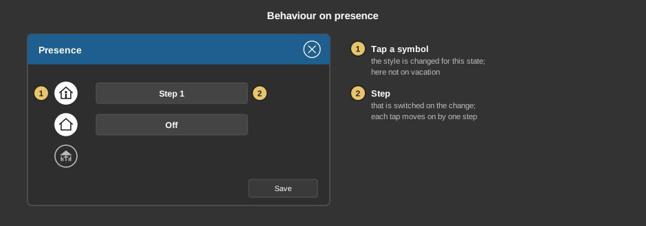
Behind the house you define which step is switched when the presence changes. A tap on a symbol selects whether anything is switched at all in this state; each tap on the field next to it moves on by one step, after the last one back to the first. In the example the ventilation runs at step 1 when coming home and goes off when leaving the house.
This section is meant for the installer of the system.
The control element comes in two variants:
Converting: In the Studio, an element of the variant Standalone can be converted into the variant Presence with the context menu entry “Convert to presence”. In the list you choose the program page; the function block is created there, its addresses are generated and the addresses of the element are placed on its inputs and outputs. Position, size and settings are kept. There is no way back.
The steps themselves are defined at the control element, see the parameter Steps. Each step has a value that is sent when it is tapped, and a caption. The tile shows the step whose value equals the value of the address.
Display |
|
| Scene selection | Defines whether the element can be selected in the control element Block Scene group. Default: on. |
| View | Block (tile) or Basic screen (circle with the current step). |
| Text top | Caption in the top row of the tile, empty by default. |
| Text bottom | Caption at the bottom of the tile. Its size scales with the element, a line break is inserted with \n, at most two lines. |
| Value display | Text shows the caption of the current step, Number its value. |
| Steps | The button ... opens the list of steps. For each step a Value and a Caption are entered; + and – add a step or remove the last one. At least 2 and at most 32 steps are possible, the default is 2 with the values 0 and 1. The caption may have two lines with \n. Only in the new block design there is an additional column Symbol: a symbol of its own for this step, for example a hand for manual mode and an A for automatic. While the step is active, the tile shows this symbol, in the dialog it appears on the button of the step. Empty: the symbol of the element. |
| Zoom text step | Size of the step in the centre of the tile in percent, default 100. |
Icon |
|
| Symbol | Only in the new block design: symbol from the symbol catalog or an SVG graphic imported into the project. It is colored to match the style. If the current step has a symbol of its own (see Steps), that one is used. Empty: the step switch. |
With the variant presence all addresses sit at the function block. With the variant standalone the following are linked at the control element:
| Switch | When a step is tapped, its value is sent. |
| Status switch | Optional. Feedback of the device, it determines the step shown. Not linked: the value of the address Switch applies. |
See also General properties of all control elements.